Mavion: brand guidelines for a quietly powerful tech company
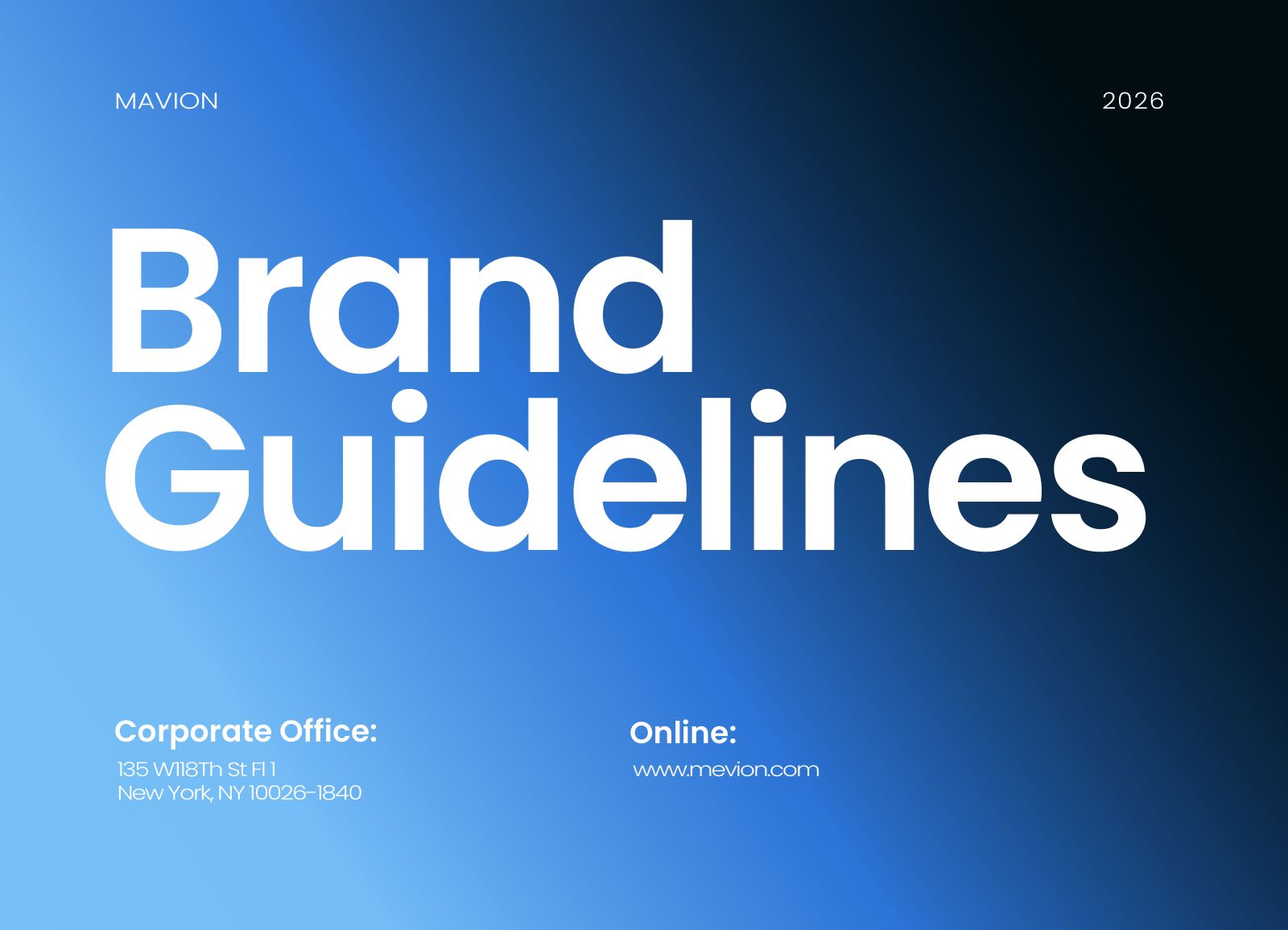
Mavion needed more than a logo: a complete set of brand guidelines that any designer, developer or marketer could follow. The brand describes itself as "quietly powerful", showcasing real, foundational technology rather than hype, and the guidelines are built to keep that tone consistent.
A logo system, not a single logo
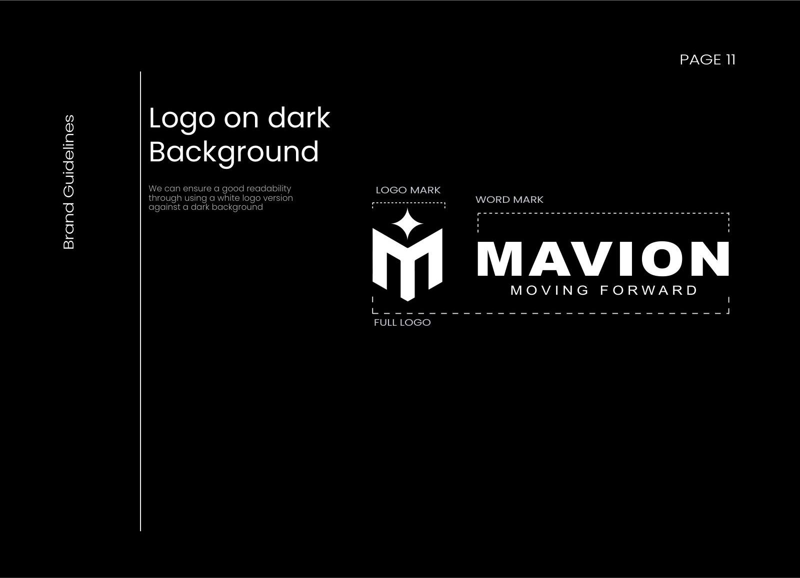
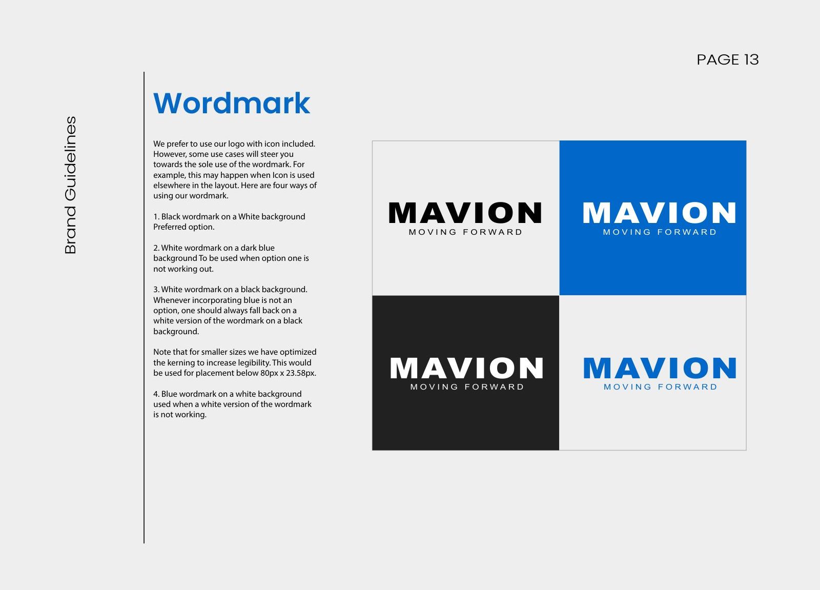
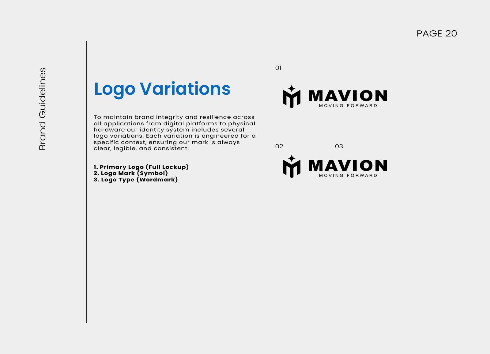
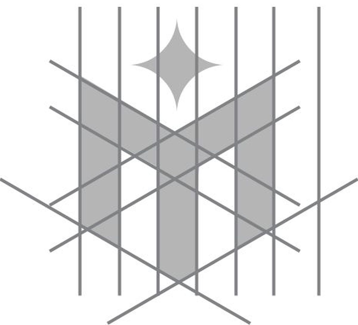
The M symbol is drawn on a geometric construction grid and works on its own as an app icon, favicon and pattern, or alongside the MAVION wordmark. The guidelines set minimum sizes, placement rules, partner lock-ups and versions for light and dark backgrounds.
Colour, type and pattern
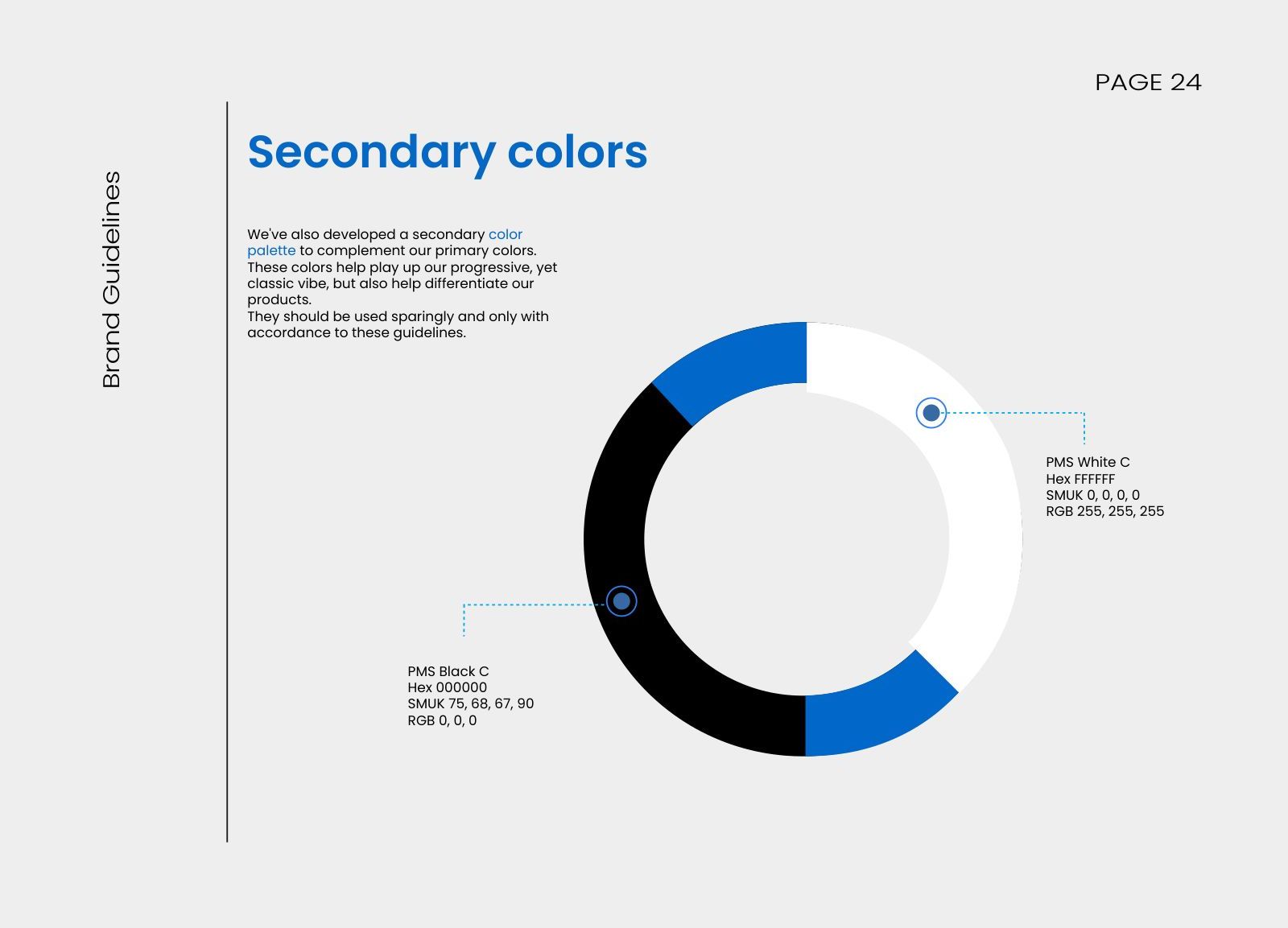
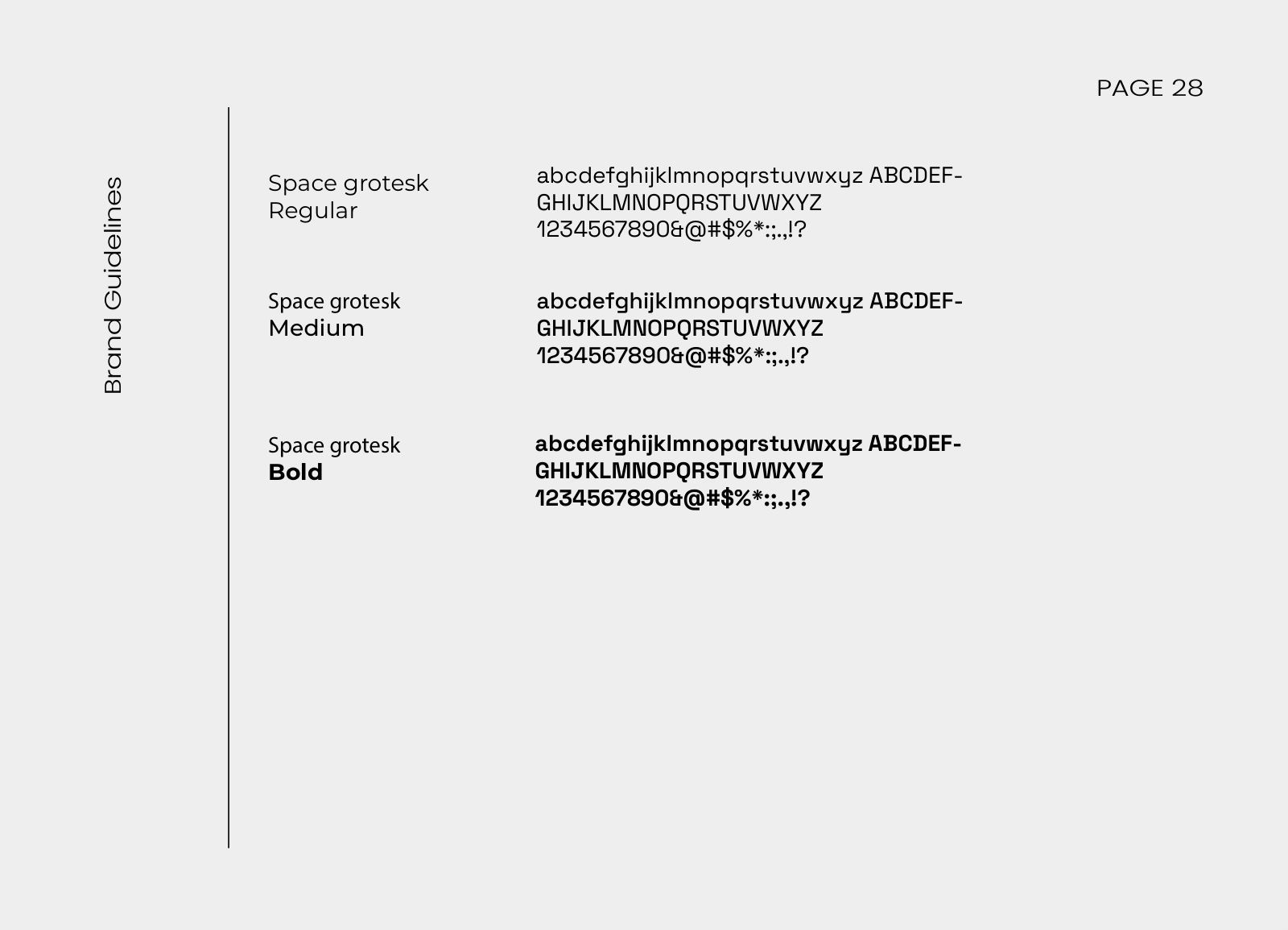
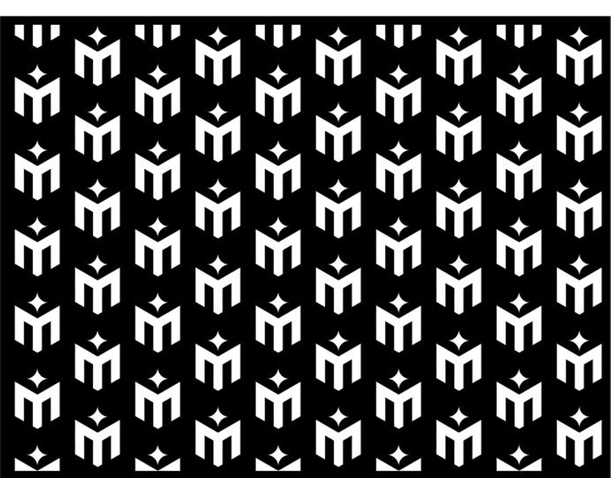
A confident blue leads the palette, supported by black, white and lighter blue tints. Space Grotesk is used in regular, medium and bold weights. A repeating M pattern gives the brand a recognisable texture for backgrounds, packaging and social content.
Voice and imagery
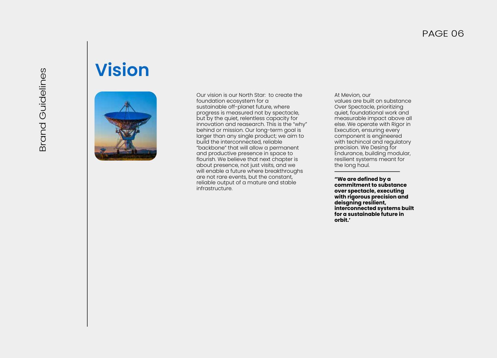
The tone of voice is defined in pairs, such as confident but never arrogant and technical but always human-centred, so writing stays on-brand. Imagery rules focus on real people, process and product detail instead of generic stock photos.
More from the identity
Want a brand like Mavion?
Human-designed identities with source files and copyright included. First brand board in 48 hours, from $250.