A restaurant logo has a harder job than most. It has to work on a sign people read from across the street, on a tiny icon in a delivery app, on a greasy takeaway bag and on the menu in someone’s hand. If it only looks good on a laptop screen, it isn’t finished.
Short answer: a good restaurant logo is simple enough to read at thumbnail size, uses one or two strong colors that suit your cuisine and price point, and has a clear name in a readable font. Pick one style (wordmark, emblem, mascot or symbol), then design versions for signage, menus, packaging and apps before you print anything.
Below: the styles, colors, fonts and sizes that work, and what it costs.
What makes a good restaurant logo?
Diners decide fast, and most of them decide on a screen. In a December 2024 survey of 1,083 US adults by Chatmeter, 46% said they would not eat at a restaurant without reading reviews first, and 36% said the menu is the first thing they look at. Your logo sits next to all of that: on your Google profile, your menu, your delivery listing and your social posts.
So a restaurant logo should be:
- Readable small. If your name can’t be read on a phone-sized map pin or app tile, it’s too detailed.
- Honest about the experience. A taco truck and a tasting-menu restaurant shouldn’t look the same. The logo sets price and mood expectations before anyone sees a dish.
- Ownable. Skip the generic forks and chef hats, or twist them into something only you have.
- Flexible. You need a full version for the sign, a short version for cups and boxes, and an icon for profile pictures.
Which logo style fits your restaurant?
Most restaurant logos fall into six styles. Toast’s roundup of restaurant logos groups real examples the same way: typographic logos, characters, icons, negative space, food used as a letter, and wordplay.
| Logo style | Best for | Watch out for |
|---|---|---|
| Wordmark (the name in a custom font) | Short, memorable names; fine dining; bistros | Long names get tiny on app tiles |
| Emblem or badge | Pubs, BBQ, bakeries, breweries, heritage feel | Small text inside the badge disappears when shrunk |
| Mascot or character | Fast casual, fried chicken, family spots, kids’ menus | Cartoon detail can look cheap if it isn’t drawn well |
| Symbol plus name | Groups planning more locations or packaged products | The symbol must make sense alone |
| Monogram | Upscale restaurants, cafés, dessert brands | Initials mean nothing until people know you |
| Hand-lettered script | Diners, pancake houses, ice cream, retro concepts | Scripts are hard to read if they’re too fancy |
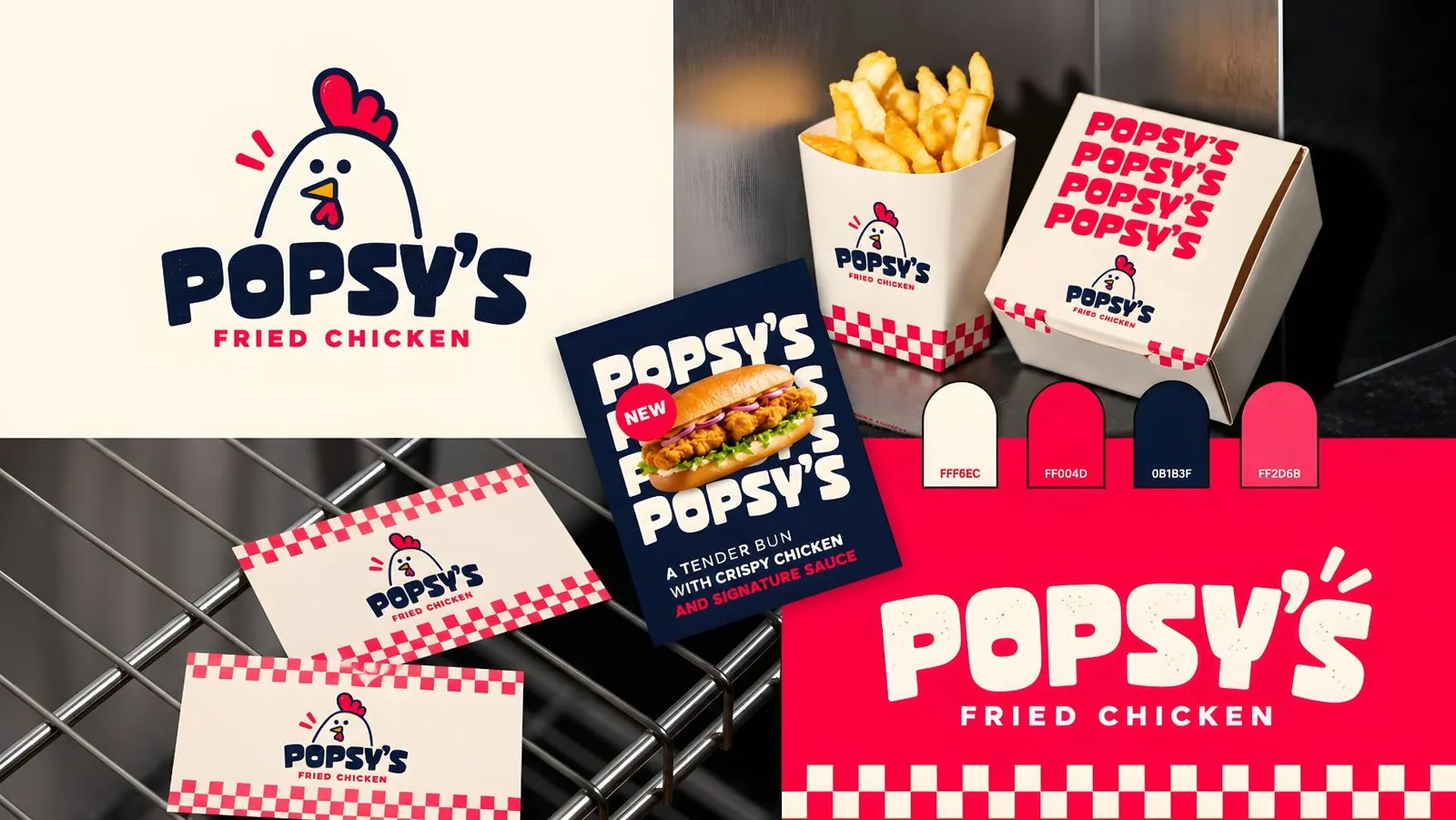
My own food work shows how style follows the concept. Popsy’s Fried Chicken (the cover image) uses a simple chicken mascot with a chunky rounded wordmark, which reads well on a fries carton, a burger box and a business card. Pops Pancakes uses a retro script plus a “PP” monogram, so the shorter mark carries the brand on bags and pattern cards. Zayka Shop puts a chef-hat-and-leaf symbol inside a bold badge that works on a jar label, a shopping bag and a storefront sign.
What colors work best for a restaurant logo?
You’ll read everywhere that red and yellow “make people hungry”. The evidence is weaker than the myth. A Chowhound article on why chains use red and yellow quotes a franchise director calling it “an old myth”, and notes that one of the studies on color and food perception was inconclusive. What red and yellow really do is grab attention, which is why fast food uses them.
A more useful way to pick colors:
- Match the price point. Bright, saturated colors signal fast and casual. Deep greens, navy, black, cream and muted tones signal slower, more expensive dining.
- Match the cuisine without the cliché. Terracotta and olive for Mediterranean, deep red and gold for many Asian concepts, warm browns for coffee and bakeries. Use them as a starting point, not a rule.
- Limit it to one or two main colors plus a neutral. Popsy’s uses navy, red, pink and cream; that’s enough to make every box recognizable.
Get exact codes: HEX for screens, CMYK for printed menus, and Pantone if you print cups, boxes or bags in volume.
Which fonts work on a restaurant logo?
Your font does as much as your icon. A few rules I use:
- Serif or elegant sans for fine dining and wine bars. Plenty of letter spacing feels calm and expensive.
- Bold, rounded or slab fonts for burgers, chicken, pizza and anything fast. They stay readable on a sign at speed.
- Script only for short names, and always paired with a plain font for the tagline (“Fried Chicken”, “Pancake House”).
- One logo font, one menu font. Keep prices and descriptions in a plain, readable typeface.
What sizes does a restaurant logo need for Google and delivery apps?
This is where many restaurant logos fail. Your logo will appear as a small square or circle long before anyone sees your sign.
| Where | What it needs |
|---|---|
| Google Business Profile | JPG or PNG, 10 KB to 5 MB; recommended 720 x 720 px, minimum 250 x 250 px (Google) |
| Delivery apps (DoorDash, Uber Eats, Grubhub) | A logo and a store header image, uploaded in the merchant portal (DoorDash); use a square version with space around it so it survives any crop |
| Instagram and Facebook | A square icon that still reads inside a circle crop |
| Signage, awnings, vehicle wraps | Vector files (SVG, PDF, AI or EPS) so the sign maker can scale without blur |
| Cups, boxes, bags, stickers | One-color and reversed (white) versions for cheap one- and two-color printing |
Google highlights your logo on your Business Profile once details like phone number and hours are filled in, so it’s one of the first things a hungry searcher sees. For the full list of file types, see my guide to logo file formats.
Restaurant logo ideas by type of restaurant
- Pizza: a bold wordmark with a single shape (a slice, an oven arch) that can be printed on a pizza box in one color.
- Bakery or pancake house: retro script with a short monogram for stickers and boxes.
- BBQ or smokehouse: a badge with a strong outer shape; keep inner text to two or three words.
- Fried chicken or burgers: a friendly mascot with a chunky font, like Popsy’s.
- Fine dining: a refined wordmark, generous spacing, one or two quiet colors, often no icon at all.
- Food truck: high contrast and a short name that can be read from across a parking lot on a wrap.
Should you make your restaurant logo yourself?
DIY tools like Canva and Looka are fine for a pop-up or a test concept; even DoorDash’s own guide lists them. The problem comes when you need a sign, a wrap and 5,000 printed boxes. Template logos are rarely unique, often aren’t vector, and can be hard to protect as a trademark. I compared the trade-offs in AI logo generator vs a human designer.
If you hire someone, ask for every format above and full copyright in writing.
How much does a restaurant logo cost?
A restaurant logo can cost anything from a free template to several thousand dollars from an agency. My guide to how much a logo costs breaks down the price ranges and what each one includes.
How I design restaurant logos for clients
I’m Abdullah Shahab, a brand designer with 7 years’ experience and 46+ brand identities designed. Every logo is drawn by me, not generated by AI, and I work remotely with restaurant owners in the USA, UK, Canada, Australia and the UAE.
- Basic, $250: one logo concept, color palette and typography, with 2 revisions.
- Premium Branding, $450: three concepts, full brand guidelines and a social media kit.
- The Brand Ecosystem, $1,050: strategy, the full identity and marketing assets such as menus and packaging.
Your first brand board arrives within 48 hours, and source files and copyright are included. See more food work on my food and drink branding page, the logo design service, or compare packages and pricing.
Working with a restaurant in Florida? I design for owners across the state, remotely, including Miami, Orlando, Tampa, Jacksonville and Fort Lauderdale. See restaurant branding in Florida or all Florida locations.
FAQ
What should a restaurant logo include?
Your restaurant’s name in a readable font, an optional symbol or mascot, and one or two main colors. A short descriptor (“Pizzeria”, “Fried Chicken”) helps if the name doesn’t explain what you serve.
Do red and yellow really make people hungry?
There’s no solid proof. Red and yellow grab attention, which suits fast food, but the research on color and appetite is mixed. Choose colors that fit your price point and stand out on your street.
What size should a restaurant logo be for Google?
Google recommends 720 x 720 pixels, with a minimum of 250 x 250, as a JPG or PNG between 10 KB and 5 MB. Design a square version so nothing gets cut off.
Can I use a chef hat or fork in my restaurant logo?
You can, but thousands of restaurants already do, so it won’t help you stand out. If you use one, change it so it’s clearly yours, like Zayka Shop’s chef hat merged with a leaf.
Sources: Chatmeter, 2024 consumer survey findings · Google Business Profile Help, Manage your photos and videos · DoorDash, How to add photos to your store · DoorDash, How to design a restaurant logo · Toast, 20 of the best restaurant logos · Chowhound, Why so many restaurants use red and yellow

Brand identity designer with 7 years of experience and 46+ brand identities for founders in tech, beauty, fashion, sports and food. Every logo designed by hand. More about me.
Want a logo you actually own?
Human-designed brand identities with full source files and copyright included. First brand board in 48 hours, from $250.