Skincare is one of the hardest categories to brand. People can’t test your serum through a phone screen, so they judge it by how it looks: the bottle, the label, the colors and the first few posts they see.
Here’s the short answer. Premium skincare brands get five things right: a simple mark that still works as a tiny monogram, a restrained color palette, typography with plenty of space around it, a packaging system that keeps every product in the range recognizable, and labels designed with the legal information in mind from day one. None of that needs a luxury budget. It needs decisions made early and applied consistently.
Below I’ll go through each one, with the label rules for the US and UK, and what a complete skincare identity should include before you launch.
Why does branding matter so much for a skincare brand?
Because more and more beauty is bought on a screen. McKinsey’s 2026 State of Beauty report puts e-commerce at 28% of global beauty sales, the largest single channel. It also expects TikTok alone to reach about $4 billion in US beauty sales in 2026, with skincare sales on the platform growing almost 300% a year since 2023.
That changes the job your identity has to do. Your product will often be seen first as a thumbnail in a feed, a 3-second clip in a shoppable video, or a small square on Amazon. It has to be recognizable at that size, before anyone reads a word of copy.
The same report notes that lower-priced, dermatologist-backed and K-beauty brands are challenging the idea that a higher price means better results. So “premium” can’t just mean expensive-looking. It has to mean clear, trustworthy and consistent.
What do premium skincare brands get right?
| What they do | What it looks like | What to avoid |
|---|---|---|
| Simple, scalable mark | A wordmark plus a monogram or symbol that works on a cap, a sachet and a profile picture | Detailed illustrations that blur at small sizes |
| Restrained color | One or two brand colors, neutrals, and one accent used sparingly | A different bright color for every product with no system tying them together |
| Typography with space | One elegant display face, one clean body face, generous margins | Five fonts and text crammed to every edge of the label |
| A packaging system | The same layout, logo position and type hierarchy across every SKU | Each product designed from scratch as the range grows |
| Labels planned early | Room for ingredients, warnings and legal details built into the layout | Squeezing required text in at the printer’s proof stage |
| Content-ready assets | Social templates, product shots and short-video graphics in the brand style | A beautiful logo and nothing to post on launch day |
How should a skincare logo work?
Skincare logos live in tight spaces: dropper caps, tube crimps, sample sachets, the 110 x 110 pixel circle Instagram uses for profile pictures. That’s why so many premium beauty brands pair a clean wordmark with a compact monogram or symbol.
You can see this in a few skincare identities from my portfolio:
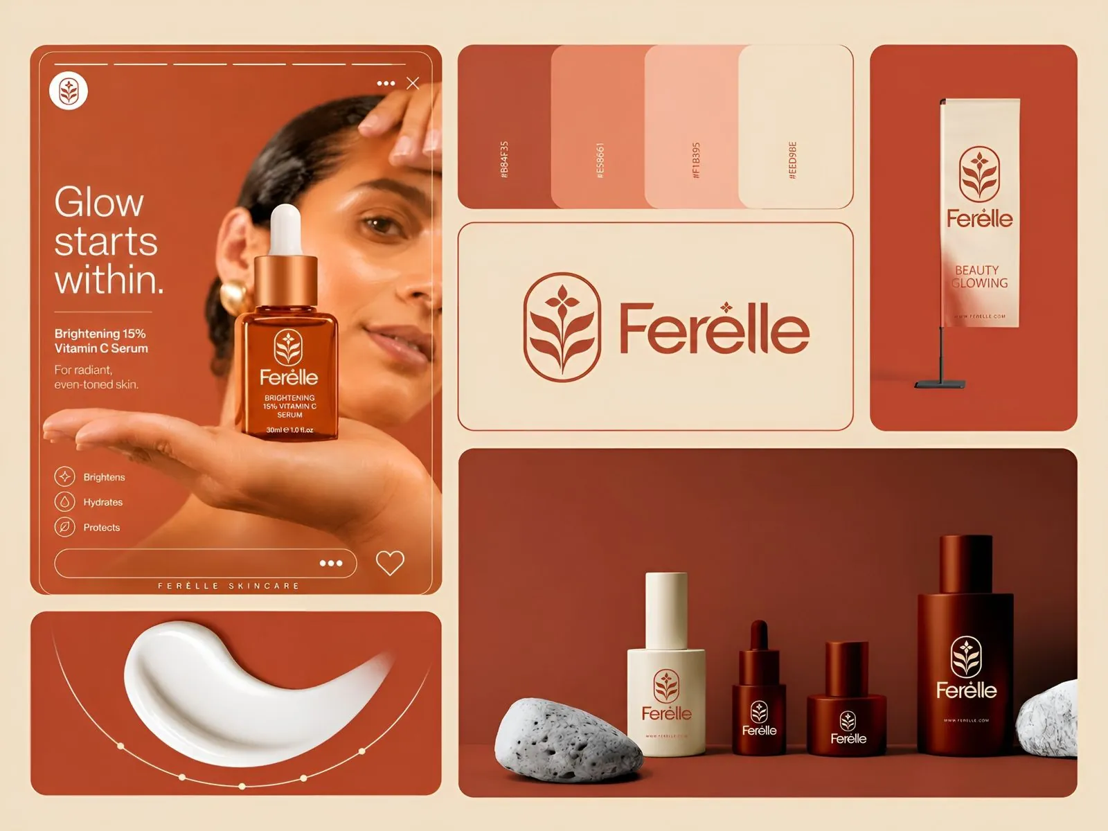
- Ferèlle uses a leaf-like monogram that sits alone on a serum bottle, a sign and a social post, next to a simple wordmark.
- SKINESK pairs a script “S” mark with a spaced-out wordmark, and the “S” carries the brand on its own on hang tags, a jar lid and a tote bag pattern.
- Lorava Cosmetic uses a geometric floral symbol that works as an app-style icon as well as on the jar and storefront.
The rule I follow: if the symbol can’t be recognized at the size of a bottle cap, it’s not finished.
Which colors make a skincare brand look premium?
There’s no single “luxury” color, but premium skincare palettes tend to share a structure:
- A base of soft neutrals: cream, warm white, sand or pale grey for backgrounds and packaging.
- One or two brand colors with real character: terracotta, deep brown, dusty lavender, sage, soft pink.
- One accent used with restraint, for a single word, a stripe or a cap.
What makes it look expensive is restraint, not the hue. Ferèlle works in terracotta and cream, SKINESK in warm brown and beige, NUVÁR in lavender and plum, Beuora in layered pinks. Each palette is narrow on purpose, so the products look like a family.
Get exact codes for every color: HEX and RGB for screens, CMYK for print, and Pantone for packaging. Colors shift between a screen, a matte paper box and a glossy plastic tube, and packaging printers will ask for Pantone references to match them. I listed the full set of codes and files to ask for in my brand identity checklist.
What typography works for beauty and skincare?
Most premium skincare brands use two typefaces:
- A display face with some elegance: a refined serif, a high-contrast typeface or a light, widely spaced sans-serif for the brand name and product names.
- A highly legible body face for ingredients, directions and claims, which are often printed very small.
The second one matters more than founders expect. Ingredient lists and warnings are the smallest text on the pack, and they still have to be readable. A thin, decorative font at 6 points on a curved bottle is a problem waiting to happen.
Space is part of the typography too. Generous margins and a clear hierarchy (brand, product name, key benefit, size) are what make a label feel calm instead of crowded.
How do you build a packaging system across your range?
Most skincare brands launch with a few products and grow to a dozen or more. Design the system, not just the first bottle.
A good packaging system fixes:
- Logo position: the same place on every format, whether it’s a bottle, jar or tube.
- Type hierarchy: brand, product name, key active or benefit, then size, in the same order every time.
- A way to tell products apart: a color band, a number, a tinted bottle or a pattern, so customers can find their cleanser without reading the small print.
- Secondary packaging: the box or carton, including its flat dieline, so it prints correctly and opens well on camera.
On Beuora, for example, the boxes, tubes and social posts share the same pinks, the same star motif and the same logo placement, so a single product photo still reads as Beuora. Ferèlle does the same with one terracotta color family across bottles of different sizes.
What must a skincare label include in the US and UK?
This is where branding meets regulation, and it’s worth planning before you finalize a layout. A quick overview:
| Requirement | United States (FDA, MoCRA) | United Kingdom (UK Cosmetics Regulation) |
|---|---|---|
| Front of pack | Product identity and net quantity on the principal display panel | Nominal content (weight or volume) |
| Ingredients | Listed in descending order of predominance | Headed “Ingredients”, descending order by weight; fragrance as “parfum” or “aroma” |
| Business details | Name and place of business of the manufacturer, packer or distributor | Name and address of the UK responsible person, plus country of origin for imports |
| Safety information | A US address, phone number or website for adverse event reports (required since December 29, 2024) | Precautions and warnings as set out in the Regulation |
| Shelf life | Not a general federal requirement | Best-before date if the product lasts 30 months or less; otherwise the open-jar “period after opening” symbol |
| Batch number | Not a general federal requirement | Required |
A few branding points follow from this:
- Leave room on the back panel. Ingredient lists for serums and creams can be long, and in the UK the details must also be on the container itself, not only the box.
- Watch your claims. The FDA says terms like “cruelty-free” and “not tested on animals” have no legal definition. That doesn’t make vague claims safe: if your product claims to treat a condition, it may be regulated as a drug, not a cosmetic.
- Design one layout that adapts. If you sell in both markets, plan a back-of-pack template that can carry both sets of details.
I’m a designer, not a regulatory consultant. Have your formulator or a cosmetics compliance specialist check the final label copy before you print.
What should a complete skincare brand identity include?
Before launch, a skincare founder should have:
- Primary logo, a monogram or symbol, and one-color versions
- A color palette with HEX, RGB, CMYK and Pantone codes
- Display and body typefaces, with license details
- Packaging design for the launch products, plus box dielines
- A back-of-pack layout with space for required label information
- Brand guidelines covering logo, color, type, photography and packaging rules
- A social media kit: profile image, post and story templates, and graphics for short videos
- Product mockups for your website, store listings and pitch decks
If you’re comparing quotes, my guide to what a logo costs in 2026 shows how different price levels map to what you actually get.
How I handle this for skincare clients
I design skincare and beauty identities around the list above, and the scope is confirmed in writing before we start:
- Basic, $250: one logo concept with color palette, typography, a mockup and stationery, with 2 revisions and 2-day delivery. Good for testing a first product.
- Premium Branding, $450: three distinct concepts, complete brand guidelines and a social media kit, with 3 revisions and 2-day delivery.
- The Brand Ecosystem, $1,050: everything in Premium plus strategy, brand voice, marketing assets and packaging, in 5 business days, with unlimited revisions on the chosen concept. For a large range, I’ll put together a custom quote.
Every identity is designed by me, not generated by a prompt. Your first full brand board arrives within 48 hours, and source files and copyright are yours. You can see more skincare, spa and wellness work on my beauty and wellness branding page, compare packages in the packages and pricing page, or browse recent work.
See beauty and skincare branding for examples and packages, or the full brand identity design service.
The bottom line
Premium skincare branding isn’t about gold foil or a high price. It’s about a mark that works at the size of a cap, a narrow palette, readable type, a packaging system that grows with your range, and labels planned around the rules. Get those right before your first print run, and every product you add later will look like it belongs.
This article is general information, not legal or regulatory advice.
Sources: McKinsey & Company, From aisle to algorithm: The beauty categories, channels, and concepts shaping 2030 growth (2026) · Arnall Golden Gregory, FDA Modernizes Cosmetic Product Labeling Requirements · Business Companion (UK Trading Standards), Cosmetic products guidance · US FDA, “Cruelty Free”/”Not Tested on Animals”

Brand identity designer with 7 years of experience and 46+ brand identities for founders in tech, beauty, fashion, sports and food. Every logo designed by hand. More about me.
Want a logo you actually own?
Human-designed brand identities with full source files and copyright included. First brand board in 48 hours, from $250.